A legacy credit union with deep roots and an eye on the future, Truity partnered with Prelude to evolve their brand for modern audiences—without losing the warmth and humanity that built their reputation.
The Ask
With more than 85 years of service, Truity Credit Union has built a reputation for outstanding service and deep community involvement. As they looked to grow their presence in new markets—particularly the Kansas City area—they recognized a need to evolve and connect with a younger audience. Truity turned to Prelude to lead a dynamic brand refresh that would reposition them as a smart, human-centered financial partner, while honoring the values their members trust.
Defining the Vision
From the outset, it was clear that Truity’s strength lay in its people-first culture. Members consistently praised the organization for its integrity, compassion, and willingness to go above and beyond—qualities that set Truity apart. Our goal was to build a brand that could scale across markets, resonate with the next generation of members, and still feel like the Truity people knew and trusted.
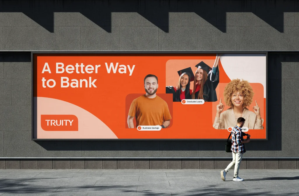
The strategy was rooted in duality: legacy and innovation, warmth and capability, neighborly and professional. The result? A fresh identity and voice that positioned Truity as what it has always been: a better way to bank.
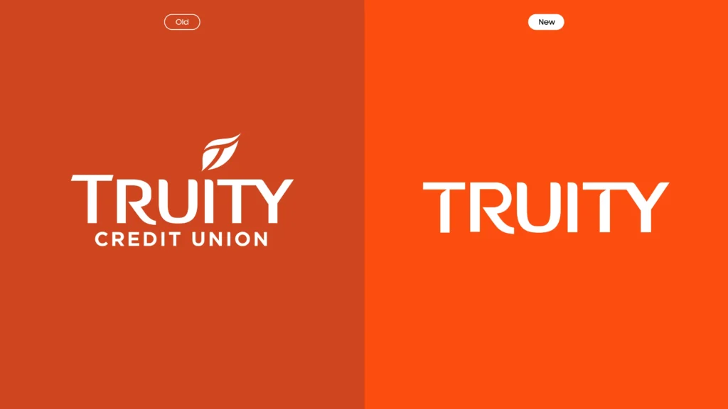
Evolving the Visual Identity
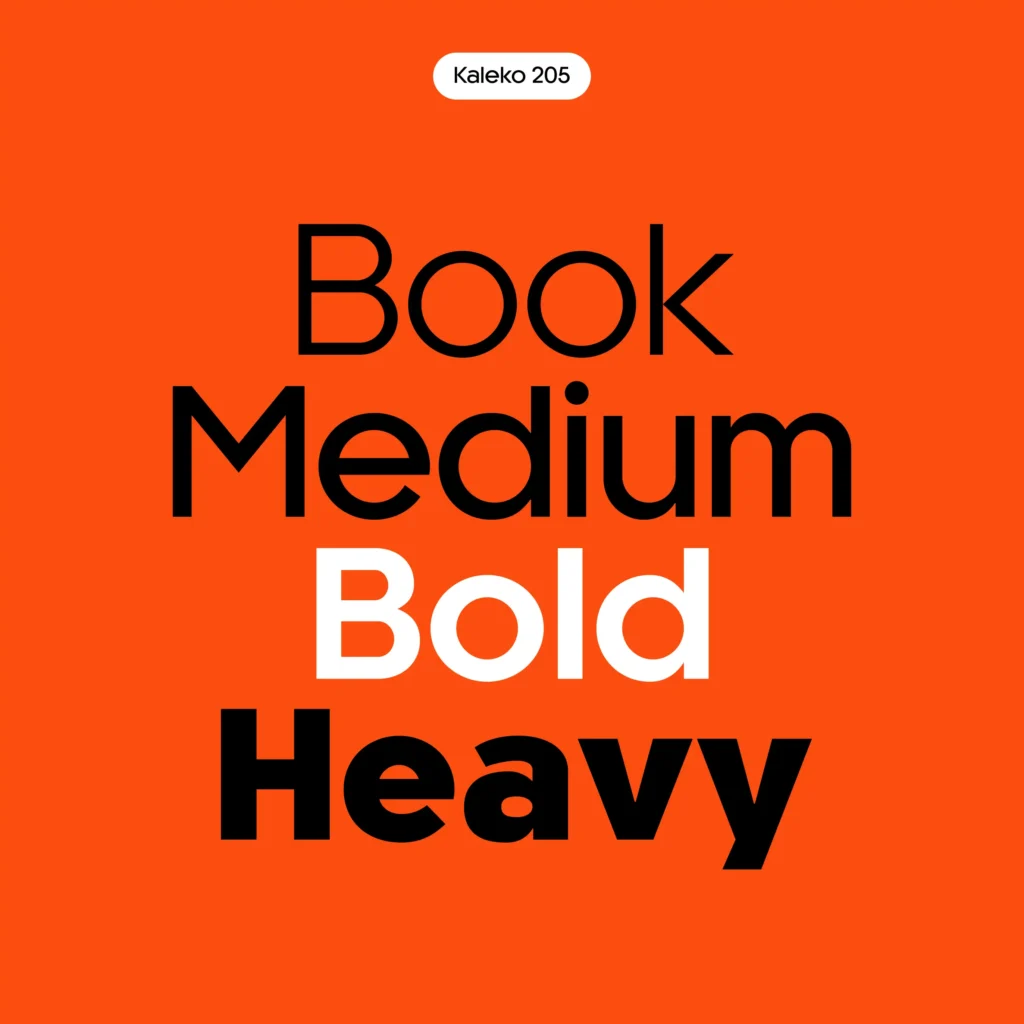
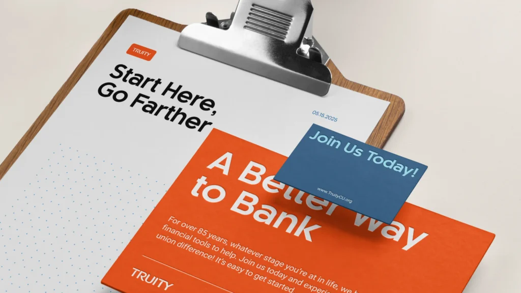
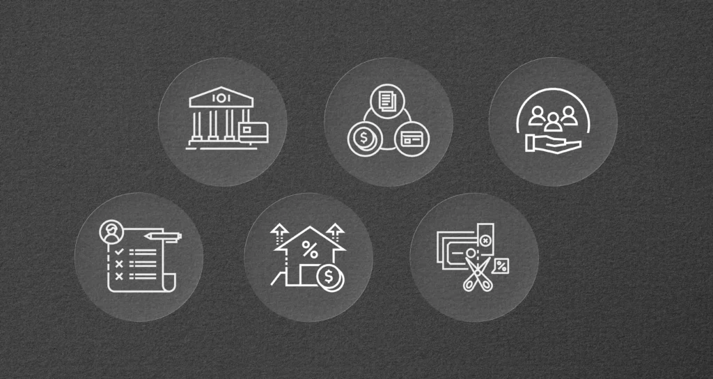
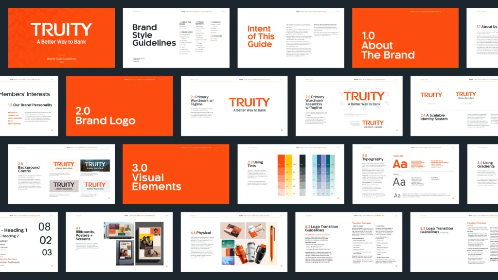
We refined Truity’s visual identity to reflect their forward-thinking approach while maintaining a sense of trust and familiarity. The updated logo, color palette, and typography system signaled clarity, confidence, and approachability—key attributes for a member-owned institution balancing tradition with innovation.
These elements were designed to flex across environments, from digital platforms and mobile apps to in-branch signage and community materials—creating consistency at every touchpoint.
Crafting a Clearer Voice
Alongside the visual system, we helped enhance Truity’s friendly, approachable, intentional voice. Truity builds with its members. This updated messaging framework provides their internal teams the tools to communicate more clearly, more consistently, and more meaningfully across all channels.
Aligning Brand with Culture
At its core, the rebrand was about aligning what people already felt about Truity with what they could now see and hear. Truity’s commitment to service—whether through financial education, hands-on support, or local involvement—was reflected in every part of the refreshed brand. The result is a brand that feels authentic from the inside out.
The Impact
The new brand system launched across key markets and internal teams with strong early enthusiasm. Externally, it signaled a shift toward a more modern, fresh, member-centered experience. Internally, it provided clarity and energy—empowering teams to speak with confidence and consistency about who Truity is and what they stand for.
Our Role
Strategy
Brand Strategy & Architecture Campaign Planning Campaign Positioning Communication and Outreach Strategy
Design
Branding Brand Guide Campaign Design Digital Design Iconography Visual Identity Voice + Messaging Development
Content
Promo Videos Script Development Story Video Production Video Direction Video Production Video Storyboarding Video Storytelling